
When Candlelight Meets Design: Holders That Belong

Step into a guide devoted to coordinating candle holders and materials with popular interior design styles, so your glow feels intentional, welcoming, and unmistakably yours. We will connect metals, woods, stones, and finishes with modern, Scandinavian, industrial, bohemian, and classic rooms, showing how small accents transform atmosphere. Expect practical pairings, honest anecdotes, and easy wins, plus encouragement to share your results for feedback and fresh inspiration from fellow readers.

Decoding Style Signatures for Effortless Pairings
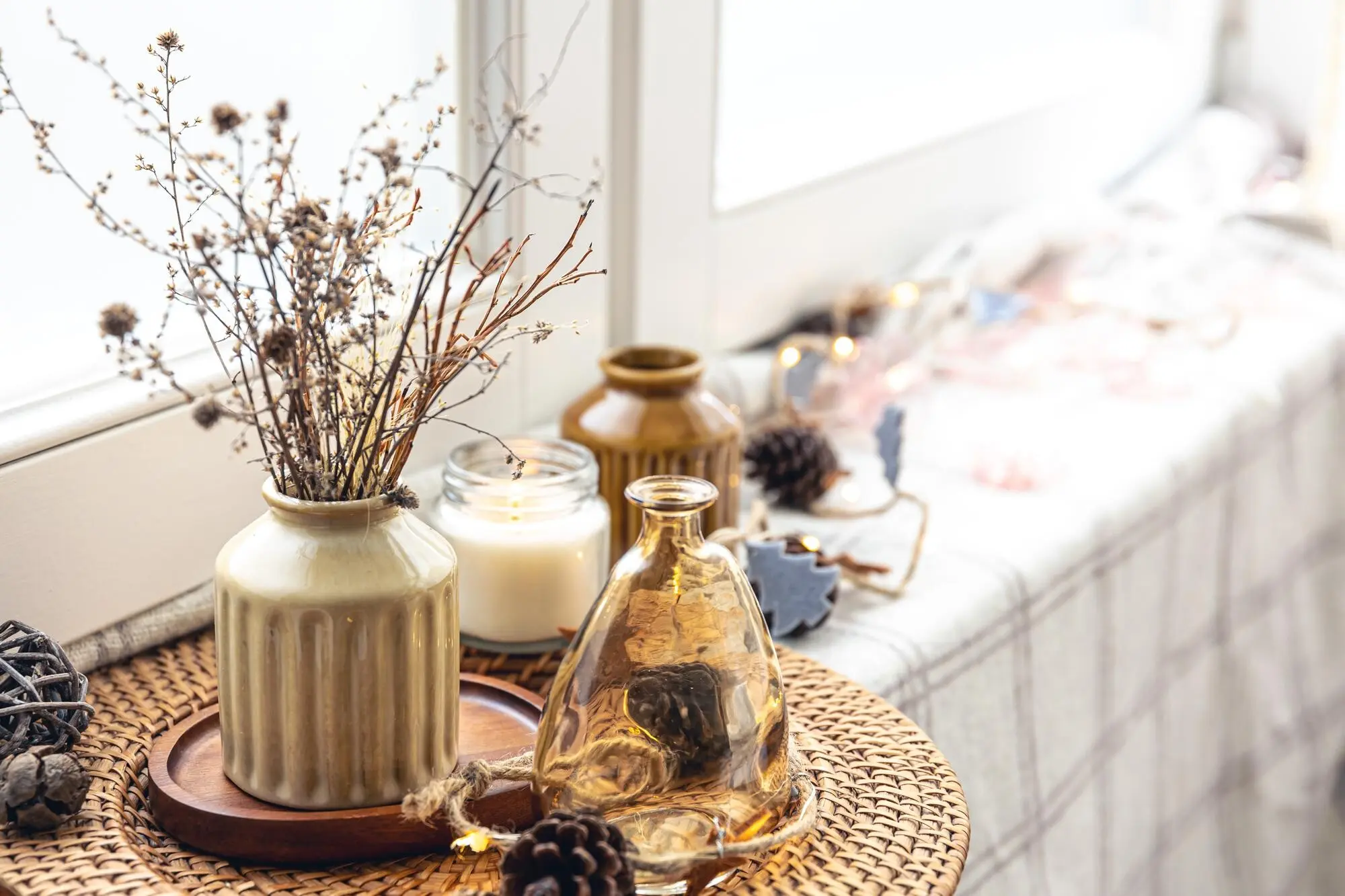
Before choosing any holder, read the room like a stylist. Notice lines, textures, and undertones living in your furniture and textiles. Minimal silhouettes crave clarity; layered interiors welcome character. Use that insight to pick materials that echo existing cues, creating cohesion without matchy predictability. This section translates broad style identities into tactile choices that make candlelight feel thoughtfully rooted, never random or store-bought generic.

Modern and Contemporary Clarity

Clean spaces benefit from refined shapes, slim profiles, and consistent finishes. Think slim black steel, brushed nickel, or clear glass that lifts the flame without visual noise. Keep groups restrained and heights deliberate to protect sightlines around sofas and low credenzas. When color appears, choose a single bold accent holder to echo art or a sculptural vase, letting light behave like punctuation rather than a paragraph.

Scandinavian Calm and Texture

Nordic rooms thrive on quiet warmth, natural textures, and gentle contrasts. Bleached woods, hand-thrown stoneware, and matte white metal holders welcome candlelight that feels like winter comfort even in spring. Layer two materials, not five, and echo pale oaks or wool throws. Cluster tapers with sturdy bases on a linen runner, inviting long breakfasts and soft conversations, while beeswax tones harmonize with oatmeal hues and pale gray ceramics.

Industrial Grit with Warmth

Exposed brick, iron beams, and worn leather crave holders that respect rugged honesty while softening edges. Blackened steel, raw brass, and smoky glass provide contrast against concrete or reclaimed wood. Choose substantial bases that feel anchored, then add one warm metal to humanize the palette. In the evening, candle reflections play across rivets and imperfect surfaces, proving that rough textures and gentle flames can share the same stage beautifully.

Materials and Finishes That Set the Tone

Brass, Bronze, and the Appeal of Warm Metal

Warm metals bridge eras with surprising ease. A lightly aged brass holder flatters linen drapes, velvet cushions, and walnut tables, adding glow even before lighting a match. Avoid overly lacquered finishes if your room prefers softness, and mix only one warm metal with an existing cool one for balance. Let fingerprints and subtle patina tell a lived-in story that feels inviting, collected, and calmly sophisticated.

Marble, Stone, and Concrete Confidence

Stone bases steady tall tapers and give instant gravitas to casual settings. White marble elevates light contemporary palettes, while dark soapstone partners with moody paint and artful shadows. Concrete brings architectural backbone to airy lofts, pairing beautifully with linen runners and dried stems. Prioritize felted undersides to protect wood, and choose veining that echoes countertops or side tables, creating a subtle rhythm that guides the eye without shouting for attention.

Wood, Rattan, and Hand-Glazed Ceramics

Organic materials lend warmth and tactility, essential for coastal, Scandinavian, and bohemian vibes. Choose hardwood holders or rattan hurricanes to soften minimal rooms without clutter. Hand-glazed ceramics bring welcome irregularity; speckles and drips feel human. Coordinate glaze undertones with rug threads and pillow piping to avoid accidental clashes. When sunlight fades, candles in textured pieces cast gentle shadows, turning quiet corners into comforting rituals that invite conversation and slow, steady breathing.

Color, Undertones, and Cohesive Contrast

A holder’s finish is a color decision, even when neutral. Undertones determine harmony: warm brass may clash with icy grays but flatter earthy taupes. Use contrast deliberately, not randomly. Echo a metal detail on cabinet pulls or a picture frame. Then layer in one surprising counterpoint to avoid flatness. This section shows how nuanced hue relationships turn candlelight into a unifying thread, guiding rooms from daylight to dusk gracefully.

Reading Undertones Like a Pro

Place your candidate holder beside main textiles under natural light. If a brass piece looks greenish next to a greige sofa, choose a rosier alloy. With woods, match cooler ash with brushed nickel and warmer walnut with antique brass. Keep swatches handy, photograph pairings at different hours, and trust the camera’s ruthless honesty. Little tests prevent big regrets, especially when ordering online or layering multiple finishes together.

Playing with Patina and Age

New rooms often feel nervous until something looks comfortably timeworn. Patinated holders offer instant calm without faking history. Pair a gently tarnished candlestick with a crisp, contemporary sconce for contrast that reads intentional. Let metals age at different speeds, avoiding synchronized perfection. Seal selectively where ring marks would disappoint, and leave other surfaces free to evolve. Over months, your arrangement becomes a diary of dinners, holidays, and softly glowing, ordinary nights.

Deliberate Contrast that Feels Intentional

Contrast works when it channels something already present. If your rug has ink-dark threads, echo them with blackened steel holders against a pale oak table. In a pastel bedroom, insert one polished nickel accent among matte ceramics for a spark. Keep repeats across the room so contrast reads as choreography, not chaos. The goal is energy with belonging, a heartbeat that never overwhelms the calm between beats.

Scale, Proportion, and Smart Placement

Great styling depends on scale. Tall tapers can frame art; low tealights keep conversations open. Groupings work best in odd numbers, with varied heights forming gentle triangles. Prioritize safety by distancing flames from foliage and fabrics. Think in zones: dining, mantel, side table, bath. Each setting benefits from different heights and materials. Here we translate abstract proportion rules into easy, repeatable placements that look magazine-ready yet live comfortably.
Keep eyes clear across the table. Use slim tapers in weighted bases, alternating heights to create movement while preserving conversation. For round tables, a tight cluster on a shallow tray prevents sprawl. Rectangular tables love a staggered runway of holders, with occasional glass hurricanes for drama. Test arrangements seated and standing, and slide pieces during a mock serving. If guests can pass bread without dodging flames, your scale is right.
Symmetry brings calm; asymmetry sparks interest. On mantels, anchor with a taller holder on one side and balance with layered books, a lower pair, and a framed print on the other. On consoles, float a trio beneath a mirror to reflect double the glow. Vary textures, not just heights, to avoid matchy fatigue. Leave negative space so every flicker has room to breathe, preventing cluttered silhouettes and accidental heat buildup.

Light Behavior, Reflection, and Real Ambience

Candlelight interacts with surfaces like water with shorelines. Clear glass multiplies flame, smoky glass deepens mood, and matte ceramic softens edges. Mirrors double the drama, while textured metals scatter playful glints. Understand how holders shape shadows and brightness, then choose pieces to suit dinners, reading corners, or baths. This section shares practical lighting truths so your glow feels intentional, empathetic, and beautifully tuned to time of day.

Stories from Real Rooms: Quick Wins that Wow

Design grows confident through small experiments. These vignettes reveal how swapping a finish, adjusting height, or adding one unexpected texture changed entire moods. You will meet spaces that felt almost right until candlelight resolved them, proving that minor choices carry major influence. Borrow ideas, adapt confidently, and share your before and after snapshots with us, so we can learn together and celebrate your subtle, luminous victories.

A Minimal City Nook Finds Warmth

A reader’s crisp nook held a charcoal chair, chrome lamp, and pale ash side table. It looked disciplined but chilly. We introduced two slim antique-brass tapers on a travertine coaster stack. Instantly, chrome felt purposeful rather than sterile, and evening reading gained intimacy. The brass echoed shoe-hook hardware nearby, stitching zones together without adding clutter. Her message the next day simply read, finally cozy, finally me.

A Rustic Kitchen Gains Subtle Spark

Butcher block, white shiplap, and stone crockery needed glow without farmhouse clichés. We paired a sand-glazed ceramic pillar with a single smoked-glass hurricane by the breadboard. During breakfasts, sunlight danced through the glass; at dinner, it deepened stew-night atmosphere. The ceramic’s tiny freckles echoed stoneware mugs, uniting open shelves and countertop. The homeowner now lights a candle while chopping herbs, describing it as a five-minute vacation.

A Loft Lounge Balances Steel and Softness

Concrete floors and steel windows felt grand yet aloof. We introduced heavy blackened-iron holders and one hand-turned walnut piece on a linen runner. Iron acknowledged structure; walnut welcomed touch. At night, reflections jittered across window mullions while the walnut caught lamplight like warm skin. The owner invited friends to vote on placements via group chat, turning styling into a playful ritual that continues every Friday evening.

Color Seasons, Switch-Ups, and Moodful Continuity

Homes breathe through the year, and so should your candle accents. Rotate materials with the seasons while maintaining a continuous thread, like a signature metal or recurring silhouette. Light summer textures give way to deeper winter tones without visual whiplash. This approach reduces buying fatigue, celebrates renewal, and keeps rituals fresh. Here are gentle, satisfying swaps that preserve identity while honoring weather, gatherings, and changing daylight.

Sourcing Smartly, Styling Bravely, Sharing Generously

Where pieces come from matters as much as how they look. Seek quality heavy bases, honest finishes, and responsible production. Thrift stores and artisan markets hold treasures with stories, while big-box finds can surprise when mixed thoughtfully. Style with curiosity, photograph experiments, then tweak by daylight and candlelight. Share your successes, ask questions, and subscribe for future deep dives, so our community can keep glowing, learning, and cheering one another onward.
Livopentozento
Privacy Overview

This website uses cookies so that we can provide you with the best user experience possible. Cookie information is stored in your browser and performs functions such as recognising you when you return to our website and helping our team to understand which sections of the website you find most interesting and useful.